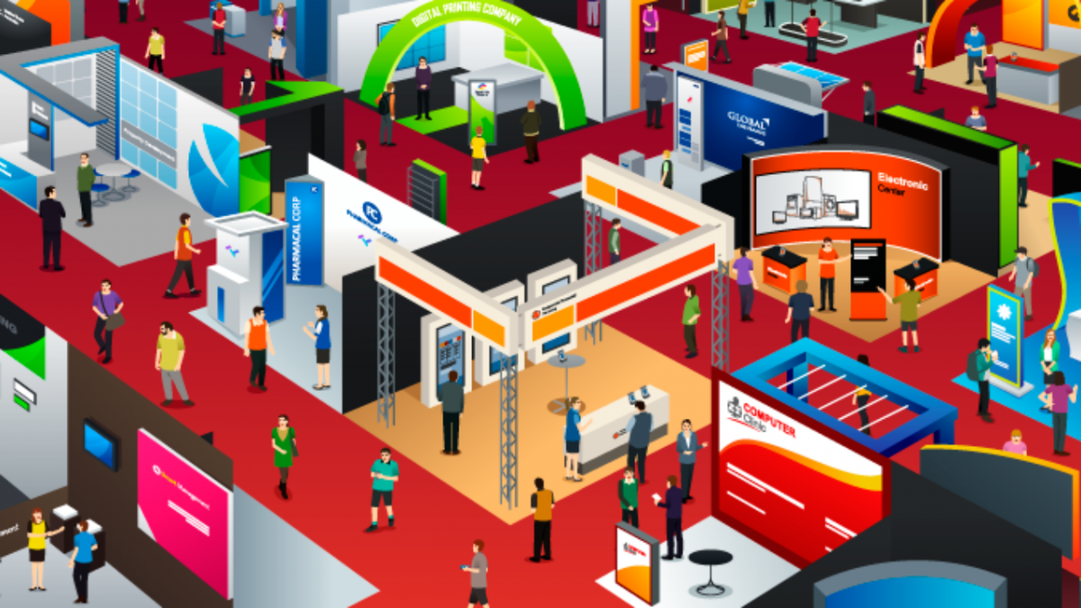
Consider your trade show display graphics to be a lot like your store front.
You literally have 3 to 5 seconds to convey your message to passersby. And in that time you must:
1. Capture and captivate your audience attention
2. Quickly communicate services or products you have to offer
3. Entice and engage visitors to enter your booth space for a chat
All in 3 to 5 seconds! Easy right?
It can be easy and it all starts with your graphics. If your graphics are intentional, you will have more success attracting attendees to stop in and learn more. But if they are a flop, you may witness folks making their way over to the open arms of your competitors.
So, how exactly do you ensure your small business booth graphics are a hit next to your big competitors? Let’s walk you through the graphic design process by examining the issues you’re facing as a small business. Here are our TOP 10 most common graphic design mistakes, along with guidelines to help you understand what to do instead.
1. Poor Image Quality
Images usually perform double duty as both the main element being noticed first and the focal point. Never, and we mean NEVER, choose images where the resolution is too low, or pixelated, for the size of your trade show display. It will not only ruin your branding message, but also make a huge impact on the rest of your exhibit.
Pixelated or low quality images will make you look unprofessional…Period. It sends out a negative message that your lack of attention to detail and most likely this will carry through to your services or products.
Consider doing this instead: Consult with a professional graphic designer to determine the necessary resolution needed for the size parameters you’re working within. As a general rule, full size backwall images should be a minimum of 100dpi, at the full print size, to not loose any image quality.
Watch now: Exhibit U Episode 3: Graphic Design Tips
2. Poor Image Selection
Considering the short amount of time you have to capture attendees interest, don’t skimp or choose sub-par imagery. Rather, one big, vibrant image must peak curiosity, generate humor or perhaps empathy to form a connection with attendees. This single engagement will then allow attendees eyes to fall on your marketing message next.
Try not to incorporate multiple images as this will force the viewer to bounce around your graphics and detract from the importance of your marketing message. Your main image can be placed above or below text or fill the entire backdrop of your display with text layered on top of the image. In either case, you must carefully consider readability.
Consider doing this instead: Take your time when selecting image(s) for your backdrop. It’s important to ensure your images portray a strong message about your product, company or brand, while providing an emotional connection with your viewers.
3. Lack of Visual Hierarchy
Visual hierarchy refers to the arrangement or presentation of elements in a way that implies importance. In other words, it’s the pathway of information instructing attendees on what to examine first, second, third, and so on. Without this, they are left searching for a focal point, often landing on less important messaging or they give up all together and walk right by.
If there is no visual hierarchy, graphics have no focal point, and attendees can’t determine which messages are the most important to read FIRST.
Consider doing this instead: Place your company logo, products or key marketing phrases within the largest portion of your display in the most prominent, visible area. Text/image size should then decrease in relationship to the hierarchy of your message importance and placement should be arranged accordingly.
4. Disorderly Image and Text Placement
The most effective location for graphics is at eye-level or across the top half of the back wall. Exhibitors often fail to account for other exhibiting props, such as folding tables, tablet/monitor stands, brochure racks or podiums, that can block attendees view of their messaging.
It’s important to also consider the type of trade show display you’re designing graphics for. If you have a tension fabric display, placement of text and images should always be located a few inches from the edge of the display so it doesn’t get lost or distorted when the fabric is stretched across the frame.
Consider doing this instead: A graphic design rule of thumb is to position all text within the top one-third of the display and always consider how your additional exhibit booth props will impact viewing.
5. Ineffective Color Combinations
Even the most well designed graphics often fail when colors and imagery clash. Limiting the number of colors or color palettes throughout your design is key. Consider instead using varying shades of the same hue or opt for dark text on top of light backgrounds and vice versa. This will ensure ultimate effectiveness and readability.
Also remember colors may look different on various printing mediums and finishes. The same CMYK or Pantone # on a glossy laminate may not visually match the fabric on your tension fabric backwall graphics.
Consider doing this instead: Utilize variations of the same hue to avoid color clashing and promote readability. Choose images and text with the same intensity and/or brightness to increase effectiveness.
6. Poor Word Selection
Selecting verbiage that is specific to product specs as opposed to what attendees really want to know is a common mistake. Leave the detailed paragraphs for handouts and brochures. Your backwall graphics should provide short benefit statements that can quickly illustrate how your products would help the end user rather than full product specs which won’t elicit much interest to passersby.
Consider doing this instead: Use benefit statements rather than product specs to explain how your offerings can meet attendees’ needs.
7. Font Selection
Choosing the right font allows attendees to read your text and digest it quickly and easily. Apply your creativity to your images and make readability a top priority for your text. Handwritten, cursive or artsy fonts may fight for attention with images, lessen readability and diminish the impact of creating message hierarchy. Choose serif or sans serif fonts styles and stick to one or maybe two font styles within your design.
Consider doing this instead: Avoid decorative text in favor of serif or sans serif fonts, and use two or fewer fonts.
8. Tiny Text
Text should be kept to a minimum on your trade show booth. While type size should vary to ensure proper messaging hierarchy, you don’t want attendees struggling to read your message from the aisle because the font size is too small. At almost every show, attendees are at least 12ft away from your backwall, so consider this general rule of thumb:
Text should be 1 inch tall for every 3 feet of distance between attendees and the text. Therefore, all text in your booth should be a minimum of 3-4 inches tall.
Consider doing this instead: Keep important text the largest and other varying messaging smaller but still within the 3-4 inch minimum height.
9. Too Much Text
Consider your backwall as a billboard, not a brochure. Select text carefully as they are critical to the effectiveness of your design. A cluttered design is often visually discouraging and makes the reader have a hard time consuming your message. Less is more in this instance. Simple and short, but compelling, easy to read sentences will be more likely absorbed by passersby.
Consider doing this instead: Limit text by employing short phrases or bullet points instead of lengthy sentences. Have your text make them want to ask questions.
10. Lack of Lighting
We are naturally attracted to brighter areas, so without proper lighting, your booth may virtually disappear on the trade show floor. Adding light fixtures to your booth is an easy way to emphasize various elements, such as a dramatic image or key phrase. You don’t have to spend a ton of money on lighting either. There are many budget friendly options such as simple arm lights or back-lighting to enhance and brighten your entire graphic.
Consider doing this instead: Illuminating certain areas on your display gives you the ability to highlight focal points you want to stress to your consumers.
FINAL THOUGHTS
By being intentional with your graphic design, your message will be read more easily and noticed at first glance. Remember, you only have 3-5 seconds! Take your time to incorporate visually pleasing photos, easy to read verbage and a color palette with varying hues will make your trade show display work for you instead of against you. If you’re unsure how to do this, our team of in-house graphics designers would love to take your backwall to the next level. Contact us today!
