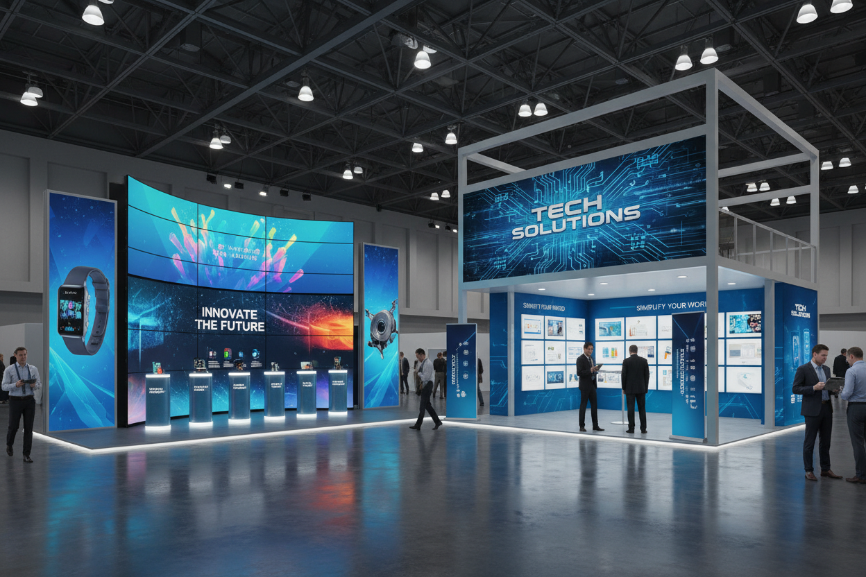
Strong graphic design often determines the first impression attendees have of your brand.
At most trade shows, you only have 3–5 seconds to:
-
Grab attention
-
Explain what you offer
-
Get visitors into your booth
That’s a lot to accomplish in a short amount of time. However, strong graphic design can make it much easier.
Good booth graphics help attendees notice your business quickly. On the other hand, poor graphics can push people toward competing booths instead.
Here are 10 common trade show graphic design mistakes and how to avoid them.
1. Poor Image Quality
Your images are usually the first thing attendees notice. Because of this, low-quality or pixelated artwork instantly make your booth look unprofessional. Blurry images can hurt your brand and make visitors question your products or services. As a result, attendees may lose confidence before even speaking with your team. Instead, use high-resolution images designed for large-format printing. Generally, full-size backwall graphics should be at least 100 DPI at full print size.
If you need professional exhibit solutions, browse Trade Show Displays from AffordableDisplays.com.
2. Poor Image Selection
Your images should create instant interest. Unfortunately, many exhibitors use too many photos or cluttered visuals within their graphic design. Instead, one large, bold image usually works better than several smaller ones. Strong visuals create emotion, curiosity, or excitement. As a result, attendees are more likely to stop and engage with your booth.
Most importantly, choose images that clearly represent your brand and message.
3. No Visual Branding Hierarchy
Visual hierarchy tells attendees what to read first. Without hierarchy, visitors may feel confused or overwhelmed. Consequently, they may skip your booth completely. To improve readability, make your most important message the largest element on the display. Additionally, place your logo, headline, or product in the most visible area.
Secondary information should appear smaller and support the main message for strong visual branding.
4. Bad Placement of Images and Text
Placement matters just as much as graphic design. For example, tables, podiums, and monitor stands can block important graphics. In addition, some displays require extra spacing around edges to avoid distortion.
For instance, Tension Fabric Displays need safe spacing near the frame edges. To improve visibility, keep important text near eye level and within the top third of the display.
5. Poor Color Combinations
Too many colors can make graphics difficult to read. Instead, use a clean color palette with strong contrast between text and backgrounds. This helps attendees read your message quickly from a distance.
For example:
-
Dark text on light backgrounds
-
Light text on dark backgrounds
As a result, your display becomes easier to read across the trade show floor.
6. Weak Messaging
Many exhibitors focus too much on product details. However, attendees usually care more about benefits than technical specs. Instead of listing features, explain how your product helps customers.
For example:
❌ “Lightweight aluminum frame”
✅ “Portable displays that set up in minutes”
Short, benefit-focused messaging is easier to read and remember.
7. Poor Font Choices
Decorative fonts may add a creative layout, but they are often difficult to read from a distance. Instead, use simple serif or sans serif fonts. Also, stick with one or two font styles throughout the design to keep everything clean and consistent.
Ultimately, clear text performs better than overly creative typography.
8. Tiny Text
Small text is difficult to read in busy exhibit halls. Since most attendees stand 10–12 feet away from your booth, your text should be large enough to read from that distance. A common rule is: 1 inch of letter height for every 3 feet of viewing distance
Therefore, most important booth text should be at least 3–4 inches tall.
9. Too Much Text
Your backwall is not a brochure. Large paragraphs overwhelm viewers and reduce engagement. Instead, keep messaging short and easy to scan.
For best results, use:
-
Short headlines
-
Bullet points
-
Simple phrases
Additionally, portable Retractable Banner Stands are great for adding extra messaging without overcrowding your main display.
10. Lack of Lighting
Lighting helps your artwork stand out on crowded trade show floors. Even simple lighting can improve visibility and highlight key graphics. As a result, your booth becomes easier to notice from a distance.
Good lighting can:
-
Draw attention
-
Highlight important messages
-
Create a more professional appearance
Fortunately, you don’t need expensive lighting systems to make an impact.
Final Thoughts on Graphic Design
Trade show attendees move quickly. Because of this, your graphic design needs to communicate clearly within seconds. Use high-quality images, readable fonts, clean layouts, and concise messaging. Most importantly, keep your design simple and easy to understand. Strong graphic design helps your booth attract attention, communicate your message, and support your brand.
If you need help upgrading your exhibit, AffordableDisplays.com offers portable displays, trade show graphics, and custom booth solutions designed to help businesses stand out.


