Let’s clear this up right away. The repetition of doing the same thing every trade show event, every year is NOT branding. It’s simply boredom.
Routine is comfortable, it’s safe and it’s a rut you don’t want to be in especially at a Trade Show. Trade shows should be everything else but routine.
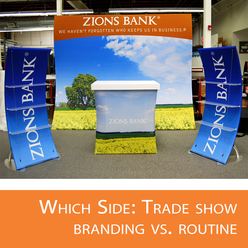
Say you go to X show each year, you bring the same display using the same graphics, you hand out the same literature even use the same giveaways, you may even wear the same clothes. By now I’m sure you’re pretty bored. And so are your customers.
Effective branding is not just a logo or certain color scheme; it’s not a product either. A brand is a promise of a clear-cut benefit and value that is fitting to your users.
It’s tough to decide whether you should step out of the branding box at a trade show. Here are some arguments as to which side you are on.
To effectively promote your brand does not mean you need to keep with the same everything. It can mean change too. Take a large corporation for instance, for example, ExxonMobil. They’ve been in business for over 125 years. Check out ExxonMobil’s history here. They’ve changed their logo over the years as often as needed to keep up with the current market. And it hasn’t slowed the company’s progression.
So, really it’s okay to take your trade show routine in a different direction. In fact, you really should Break the Routine all together today. Here are two quick pointers on what you can do to increase attention to your graphics.
According to a study by the Pennsylvania College of Optometry, there are two simple elements that can enhance graphic effectiveness.
1. Adding a border to focus attention on your sign helps the viewer read it 26% faster. That’s a big advantage in a fast-paced marketplace.
